
Okay, so, you know how some art just kinda…sits there? And then other art grabs you, shakes you, and leaves you a little breathless? That’s what we’re talking about today. It’s about that visceral punch, that visual sting. I’m Eleanor Vance, by the way, and after years of staring at masterpieces (and some not-so-masterpieces) at the Met and then yammering on about them to bright-eyed students at Yale, I’ve developed a soft spot for art that *moves* you. Today, we’re diving into how artists use contrast and tension to create that “viper bite” effect – that immediate, unforgettable impact.
The Power of Opposites
Contrast, baby! It’s not just about light and dark, although that’s a great place to start. Think about it: smooth vs. rough, detailed vs. abstract, vibrant color vs. muted tones. It’s about juxtaposing elements that clash, creating a visual friction that demands attention. When I was working on my dissertation back in Boston (feels like a lifetime ago!), I became obsessed with Caravaggio. That guy knew how to use chiaroscuro to make your heart stop. The drama! The shadows!
Consider the color wheel: complimentary colors crank up the visual volume. Think bright red against deep green, or electric blue against fiery orange. It’s a visual jolt, a little electric shock that wakes up your eyeballs.
Tension: The Unspoken Drama
Tension is the art of making the viewer *anticipate* something. It’s that feeling of unease, that sense that something’s about to happen. Composition plays a huge role here. An off-center subject, a tilted horizon, a figure caught mid-motion – these all create a sense of imbalance, a feeling that the image is about to tip over, to explode.
Think of a coiled spring, ready to unleash its energy. Or a figure perched precariously on the edge of a cliff. The viewer is drawn in, waiting for the inevitable release. This anticipation keeps them engaged, invested in the artwork. It’s like Hitchcock said, “There is no terror in the bang, only in the anticipation of it.”
Examples in Practice
Let’s bring this home. Think about the graphic novel work of someone like Frank Miller. His Sin City series? Pure contrast. Stark black and white, punctuated by splashes of violent red. The compositions are often claustrophobic, pushing the characters to the edge, creating a palpable sense of tension. Every panel feels like a punch to the gut.
Or consider Barbara Kruger. Her work is ALL about contrast. Bold text, often declarative statements, plastered over stark black and white photographs. The message is immediate, confrontational, designed to provoke a reaction. It’s advertising flipped on its head, using the same visual language to subvert the very messages it usually promotes.
Why It Matters
So why is all this contrast and tension so important? Because it makes art *memorable*. It creates a visceral connection with the viewer, bypassing the intellect and going straight for the gut. In a world saturated with images, art that dares to be bold, that embraces the push and pull of opposites, is art that stands out. It’s art that bites.
And isn’t that what we all want, really? To create something that lingers, that resonates, that leaves a mark? I think so.
Saul's world flipped upside down on the Damascus road! Divine light, a rearing horse, and instant faith. Dive into this Read more
Talking donkeys, hidden angels, and a stubborn prophet! Dive into the bizarre and beautiful story of Balaam's donkey. It's way Read more
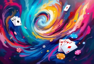
The world of online casinos can feel like stepping into a dazzling, albeit sometimes overwhelming, art gallery. So many options, Read more


