Less is More: Deconstructing the Clutter
I remember back in my Met days, we had this exhibit on Bauhaus. Blew my mind. The idea that form should follow function, that simplicity could be beautiful… it’s stuck with me. And you see it everywhere now, from website design to branding. The Apple logo? Boom. Nike swoosh? Pure genius. It’s not just about taking stuff away; it’s about what you leave behind.
Minimalism in graphic design isn’t just some trendy aesthetic; it’s a deliberate choice. It’s restraint. It’s knowing when to say “enough.” It’s about creating a visual hierarchy that guides the viewer’s eye, ensuring that the message, the core idea, punches through the noise. It is a way of living.
Contemporary Masters of the Minimal
Take, for instance, the work of folks like…well, I’m not going to name-drop too hard (though I could, darling, I could). But think about those designers who can distill a complex concept into a single, striking image. They’re the real deal. [img = A series of minimalist posters, each featuring a simple geometric shape and a single word, such as “Hope,” “Courage,” “Silence.”] Their work transcends mere aesthetics; it becomes iconic, memorable, and damn near impossible to ignore.
The Psychology of Empty Space
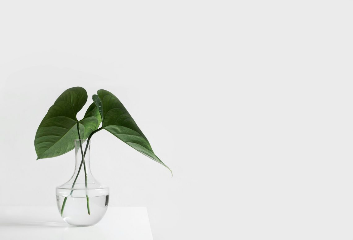
Negative space. Oh, honey, that’s where the magic happens. It’s not just about filling the void, it’s about letting the eye breathe. It’s about creating tension, anticipation. It’s like a great jazz solo—the notes you don’t play are just as important as the ones you do. When used correctly, negative space can transform a design from ordinary to extraordinary. Trust me.
Typography: The Unsung Hero
And what about typography? Oh lordy. I mean, give me a beautifully rendered sans-serif any day. But seriously, the right typeface can make or break a minimalist design. It’s about choosing a font that’s both legible and expressive, that complements the overall aesthetic without overpowering it. It’s about kerning, leading, and all those other nerdy details that make a design sing. And let’s be honest, who doesn’t love a good sing.
A Word of Caution (and a Little Sass)
Now, before you all run off and start deleting everything from your designs, let me offer a word of caution. Minimalism isn’t about being lazy. It’s not about throwing a bunch of white space around and calling it a day. It’s about intention, purpose, and a whole lot of editing. And if you think you can just slap a minimalist label on anything and call it art, well, darling, you’ve got another thing coming. It takes work, it takes vision, and it takes a healthy dose of self-awareness.
So, go forth and create, my dears. But remember: less really can be more, if you know how to wield it. And for God’s sake, don’t be boring.


